Let's Fix Kenwood's Car Stereo Interface
I recently needed to replace an in-car stereo and nav system with something more modern. I quickly realized that from a design and user-experience perspective, the aftermarket stereo landscape is a complete disaster. There seems to be little to no conscious effort to optimize these systems for real-world usage, and the interface design feels like an afterthought.
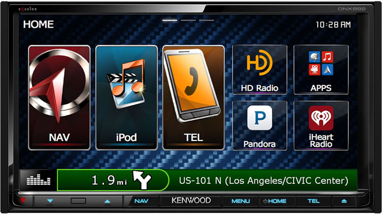
I ended up selecting a model from Kenwood, as it was the best balance of features and price This is what you’re presented with when you start your car with a Kenwood DNX892 installed. Keep in mind that this is in Kenwood’s flagship line of products.
And here’s my take on what it should be:

A list view:
Here's What's Wrong
- At the highest level, Kenwood seems more interested in showing you what their systems are capable of than focusing on giving you the most important choices at the right time.
Garish, distracting design aesthetic. The point of these aftermarket systems should be to integrate as well as possible with your car while providing a superior user experience (both visually and aurally).
As an example, that strangely-lit, blue, carbon fiber background has absolutely nothing to do with anything, aside from someone thinking it looks "racy". It serves no purpose other than to distract the user by adding visual noise. There is no car in the world in which this texture looks natural.
- Ridiculously large amount of wasted space. A screen of this size needs to be efficient and place a very high value on each pixel. As one example, in the above screen the "NAV" and "TEL" buttons occupy almost 1/4 of the entire screen real estate. These are both buttons that have physical equivalents at the bottom of the unit. You don't need both.
User Models
There are 2 types of physical interactions with a system like this.
- "I have time to look at the screen and perform complex tasks"
- "I'm driving, and need to make changes based on feel or approximate location because my attention is on the road"
The current system doesn’t seem to make any distinction between these models, and everything is presented as if the user is giving the system their full attention.
As an example, on the touchscreen, arguably the easiest location to find without looking is the bottom-left corner. It’s the closest point to the driver’s hand, and can be found by feel due to the bezels. Kenwood has taken this critical location, and dedicated it to the equalizer button!
How often do you actually adjust the EQ on your car stereo? Maybe a handful of times over the course of its life? On this system, the EQ button is in the core position on EVERY. SINGLE. SCREEN. Even when you’re in navigation mode, the EQ is still the dominant control.

This area should be dedicated to the most common activity for a given context. In this case, if I’m in my favorites list, it should be used for cycling through my favorites.
There are dozens of examples of this lack of user empathy throughout the system.
Showing the Wrong Information
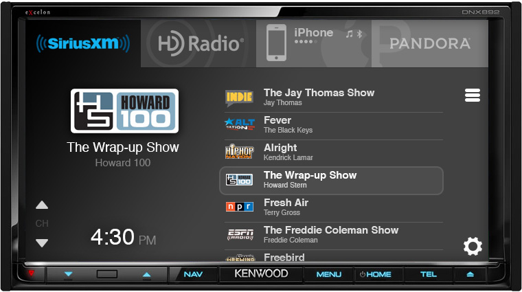
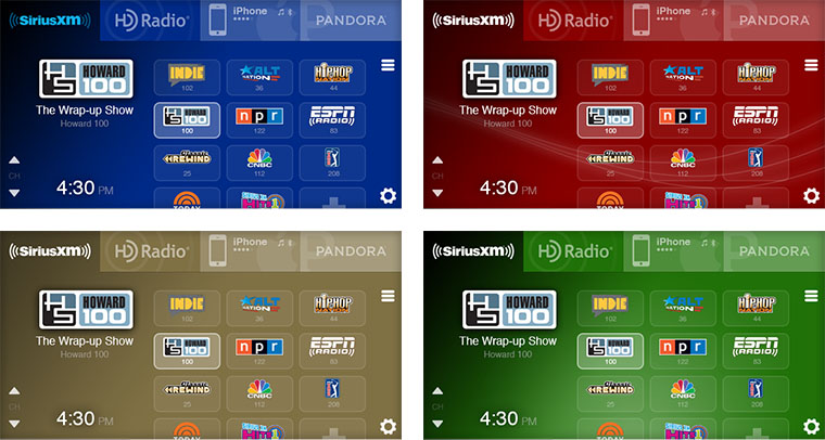
Here is what you see once you select an audio source.

Let’s start with the complete waste of space that is the green navigation bar. Its sole purpose is to tell you that the navigation system is active, and will also show you the current street name. This is almost completely useless in this context. If I need navigational information, I’ll press the physical “NAV” button. This is wasting approximately 11% of the screen real estate.

Now let’s move our attention to the preset buttons (listed as P1 through P6 above). I hope you have a good memory, as these are the only labels you’ll get. I guess the upside is that you only have 6 slots to fill with presets. To be precise, you can actually store more than 6 presets, you just have to store them in different “bands”, which makes absolutely no sense in a modern system. You have to press an action button, then select the other band, and then press another button to exit the band selection. After all of this, the current P1-P6 is replaced with another set of P1-P6 buttons that look identical to the first.
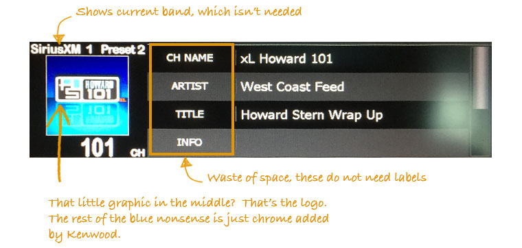
Why not show channel names and even imagery, since HD Radio and SiriusXM support these? This is seriously broken and woefully lazy design.
A Look at an Alternative
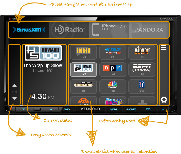
In my opinion, the key is striking the right balance between giving the user a rich, fully featured experience when they have attention to give, and simplifying things when they don’t. Remove the clutter, focus on what’s important, and consider the user.
Let Them Build It
Kenwood should also take a cue from other enthusiast-based markets and let their most ardent fans contribute. If you get the hardcore folks on board, they will espouse your products for free.
One way of doing this is to allow customers to create and share their own themes. This accomplishes two goals:
- It will improve loyalty among these enthusiasts. When they can contribute their own preferences to their purchase, they're much more likely to develop a fondness for it.
- They can create a collection of themes tailored to certain cars, which can then be shared with other users.


The Tip of the Iceberg
There are many more views than the ones shown above (there are dozens of settings screens alone). However, if designed correctly, the redesigned home screen is the one in which a user will spend the vast majority of their time. In the world of web and app development, we’re used to a certain level of rigor as applied to interface design work. This does not seem to be the case in the aftermarket audio industry (hell, even OEM systems are mostly rubbish).
I don’t mean to single out Kenwood here, just about all of these manufacturers produce terrible interfaces. There’s certainly an opportunity for a company like Kenwood to differntiate itself by placing an emphasis on user-centered design, and don’t treat the software as an afterthought.